Louella Court has moved!

December 4, 2008 by

We’ve made the move over to a new home on TypePad…. please come visit us!

http://louellacourt.typepad.com

You’ll find a sneak peak into our brand new studio space with lots of great photos, and we have a handful of exciting posts in the works that we will be bringing to you soon.

Please take a moment to update your bookmark or RSS Feed so we can continue to bring you new designs, inspiration, and updates on Two Paperdolls and Louella Press.  Thanks for making the transition with us — we look forward to seeing you there!

Growing and Growing and Growing…

November 18, 2008 by

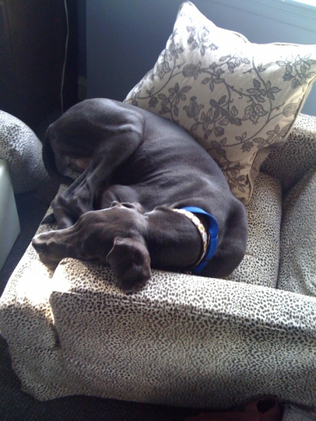
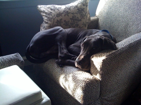
No, I’m not talking about our business as we’ve taken over a new office space (even though we do still owe you some photos and details!)…. I’m talking about our good friend, Clark. Remember him? The boss brought him in for a visit to the new digs last week, and although he is still considered a “puppy” at 6.5 months old, he is far from little!

photo

photo21

These were the only shots I was able to capture of Clark with my iPhone, as he was just too quick otherwise!  The active part of him is still, indeed, a puppy, as this was the only moment all day that he took a rest.

I’m not sure that these photos fully express how big he is, but all I can say is that this chair in Vanessa’s office is actually quite spacious, and Clark could only get comfortable by folding his back legs completely under him. Looks like we need to buy him a bigger bed for his next visit!

During his day here, Clark found some treasures in our garbage cans, enjoyed sliding around on our bamboo floors, pulled the boss down the street as she took him for a walk (or is it the other way around?), and knocked Maggie over. All in all, I’d say he had a great day!

Out of office reply

October 13, 2008 by

Hello all. Sorry for disappearing, just when things were going so well. We’ve wanted to write and fill everyone in on all the big news around here, but that’s the thing about big news- it usually comes with a lot of hustle and bustle, and that’s mostly what we’ve been up to.

So what’s all the hustle and bustle about? After four years Two Paperdolls and Louella have finally outgrown our spot here on Louella Court and we’re expanding with a move to a new location! Not to worry for those of you in the area, we’ll be just down the street… Still within walking distance of Johnnie’s Dog House milkshakes and fries. So mark your calendars- on Monday October 27th we will open the doors to our new and improved studio on West Avenue in Wayne!

When we close the doors on our storefront at the end of this week there are certainly things we will miss, but for the most part we are looking forward to the perks of all working in the same building with lots of studio and office space, and plenty of room for our presses and storage. And speaking of perks, we are beyond thrilled to be working with an amazing duo of interior designers at the new location. As designers ourselves, we realize the importance of putting this sort of large project in the hands of professionals, and that is just what we’ve been able to do with Winnie King and Laurie Shipley of Environements HC. The two have a unique talent for understanding the needs and style of a client, and bringing together an amazing mix of color, lighting, custom furniture and art. And it doesn’t hurt that their humor and patience means that working with them is a lot of fun, even in the midst of a move! Needless to say, we’re lucky to have their hands in turning a humble office building into a beautiful space that we will be proud to invite clients and friends to.

By now, we hope you’re wondering (like we are) what the studio will look like when it’s all said and done. Of course we’ll be posting plenty of photos with details about the transformation once we’re settled, but for now here’s a little sneak peek of what’s in store…

An organic linen paired with a pop of teal?

Imagine this in charcoal black

Storage anyone?

Stunning Simon Pearce

Love this silhouette

Check back soon for an update, complete with lots of photos of our new studio! For more information about Environments HC contact: environmentshc@aol.com.

Two Paperdolls on NBC10!

September 11, 2008 by

I’ve been very reluctant to say goodbye to summer this year, but the good news is that the change in season means a fresh round of design trends and inspiration. The Knot’s Rebecca Dolgin talked about some of these fall looks in wedding stationery on NBC10! yesterday, using our designs for example. I must say, it was pretty exciting to see our work showcased, and alongside one of our favorite florists no less! Click here to see the full clip… You may recognize one of the designs.

HOW did that happen?*

September 5, 2008 by

With as much thought and planning that goes into our designs, it’s very exciting when we get a nod from an internationally respected design publication. That is why we are thrilled to announce that we received an Award of Merit in HOW magazine’s 2008 Self-Promotion Design Annual.

The award went to one of our favorite pieces, an invitation to our Designs and Desserts cocktail party during the National Stationery Show last year.

And though we all share in our high points as a team, special credit for this unique design goes to Lauren Mummé and Vanessa Kreckel, who worked right down to the deadline brainstorming, designing and perfecting the details that make this piece stand out.

Congratulations ladies!

And just in case the Designs and Desserts piqued your interest, here is a snapshot of the favor table before the party. We were on a sugar high for weeks!

*HOW did the title of this post happen? I have a love/hate relationship with puns. Somewhere around the time I discovered The Hairport near my apartment I realized that I had a grudging affection for word play. It’s the “so bad it’s good” syndrom. Hence the title of this post… I just couldn’t help myself.

An elegant evening

August 29, 2008 by

At Louella Press, we love the opportunity to design a custom variation on one of our engraved pieces, and the invitations for this sophisticated affair are a perfect example. This chic couple came to our Chicago retailer, Pulp and Ink, and chose our Urban Flourish invitation. When they decided to add an extra bit of flair, we set to work and came up with the contemporary flower motif pictured below. The bride liked it so much that she incorporated the flower through the programs, place cards and menus that we also designed. To tie everything together, we sent our invitation design to the talented Chicago baker, Takes The Cake, and you’ll see how they used the florals in their stunning cake design. It’s always a treat to see how the pieces come together for a gorgeous evening!

Thanks so much to Artistin Events in Chicago for their beautiful photos of the soiree!

Hearn colage

An elegant evening

For more photos of the invitations, please see the custom work on our website. Photos nine and ten are of this unique peice. The inviation and all day of items were engraved in three colors on our stunning metallic gold stock.

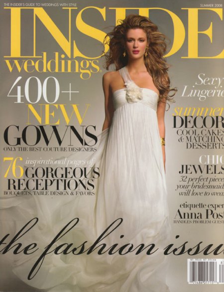
In related news, we weren’t the only ones raising our eyebrows at the details of this sophisticated evening. You can find the wedding (along with lots of photos of our work) in the Summer 2008 issue of Inside Weddings. This magazine is well known for documenting unique and beautiful weddings for all different tastes. Pick up a copy while it’s still on the stands!

Inside Weddings Summer 2008

Inside Weddings Summer 2008

Inside Weddings Summer 2008 Hearn Story

Inside Weddings Summer 2008 Hearn Story

Perfectly Minted.

August 18, 2008 by

If you are a lover of fine papers and custom invitations like us (and you don’t live under a rock), you have most likely been hearing a lot of buzz about Minted recently. We are thrilled and honored that Louella Press is one of the brands being offered by Minted, among such great company as Egg Press, Mr. Boddington’s Studio, and Wiley Valentine, to name a few. Ordering your dream invitations online has never been so easy!

Minted is still growing and getting set up with all of the amazing invitation suites available from its brands, but until then you can call 888.828.MINT to order any Louella invitation your heart desires, including our newest engraved design, Modern Meadow, which is available exclusively through Minted.

The right place at the right time.

August 13, 2008 by

I am not going to lie: working for Two Paperdolls and Louella Press certainly has its perks when it comes to planning a wedding! I was very fortunate to begin working here almost a year ago while beginning to get into all the nitty gritty details of my September 2008 wedding, and in preparing for our big day I have been able to make use of some of the amazing resources just oozing out of this place. The prime example: our beautiful engraved wedding invitations.

I posted about these on my blog over at Weddingbee, and of course I have to share my masterpiece with those of you strolling through Louella Court as well! Without further ado, our wedding invitation suite that finally came about after months of obsessing, nitpicking, kerning and perfecting:

Close-up of the envelope liner and the invitation. The top teal layer of the invitation is die-cut with the scroll shape, and layered on top of the white layer with our actual wedding info.

The top left corner of the invitation with our wedding date engraved

Engraving is a really amazing printing method. Never seen it? Allow me to tell you more…

Basically, engraving is the only process that allows the ink to sit on top of the paper, creating both crisp ink definition and a raised texture. The back side of the paper is “bruised” from the pressure of the engraving process, giving it a delectable hand-touched feeling (which is illustrated in a photo further down in this post). Thermography is also raised printing, but it creates a shiny effect (which, personally, I am not a fan of), and does not create bruising. The raised effect of thermography is a result of a resin powder that is applied to an offset printed piece, rather than the pressure of the engraving process.

Some people mistake engraving for letterpress, simply because they haven’t seen it before and they are only familiar with the texture that results from letterpress. The main difference here is that with letterpress, the ink is actually pressed into the paper, creating a relief texture. This results in a beautiful piece, but does limit your ability to use dark or colored papers. With the aforementioned pressure used in the engraving process, the ink sits on top of the paper, allowing for some amazing and crisp contrast. The green and white ink on the teal paper would not be so crisp and bold if I had used letterpress. (And don’t get me wrong — I love me some letterpress, but this particular design would not have worked with letterpress.)

I have to thank fellow doll and Louella Court contributor, Maggie, for taking pity on my poor, pathetic camera and letting me borrow her fabulous camera to capture these detailed photos for you (thanks, Maggie!). Below is a bit more invitation eye-candy that resulted from my little glamour shoot and hopefully these photos will help you see what engraving allows you to do.

I used Albemarle Swash for our names; the rest of the type is ITC Souvenir

I love how the envelope liner ties it all together! The vector art pattern was purchased on istockphoto.com and I modified the colors and tiled the seamless pattern in Adobe Illustrator. The envelope liner was flat printed (also referred to as “offset”), because engraving would have been a little ridiculous and the amount of coverage would have made it extremely difficult for our engraver.

I am in love with our reception card

My absolute favorite detail…. I put an asterisk after “dancing” and added this line at the bottom. I think it’s charming, if I do say so myself!

This close-up really illustrates the texture of engraving. See how there is actually some dimension to the word “celebrate” sitting on top of the paper?

And here is what the back of the reception card looks like. I had it duplexed with teal stock to add a little surprise element of color to the back of the card, but what I really want to show you is the bruising that occurred from the engraving process. You can see the indentation of the scroll shape as well as where all of the type is. Isn’t that fabulous?

Our reply set

I couldn’t bear the thought of mismatched stamps after all of the work I put into the invites, so I bit the bullet and ordered custom stamps from Zazzle. I requested expedited service since I had put off getting my stamps — I ordered them at 10 a.m. on a Wednesday morning and received them at 10 a.m. the following day, from California! Not bad for $18.99 extra, and totally worth it to get these in the mail a little quicker.

A detailed look at the response envelope

I flat-printed our directions and accommodations insert. I made it a tri-fold to include every ounce of information our guests could possibly need!
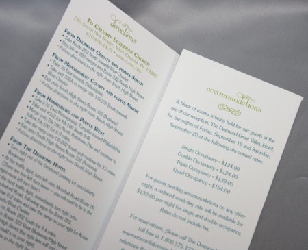
If you ever doubted how committed I am to details, I’m sure there’s no denying it now!

The beautiful calligraphy

The back of our outer envelope, complete with our wedding date

Engraved thank you notes to correspond with our invitations

And matching envelopes, to boot

So, there you have it! I fully realize how completely fortunate I am to work in this place with all of these spectacular resources, and I probably would have had a much more difficult time trying to coordinate all of the engraving details on my own without the help of some generous colleagues. All of the hard work paid off as the invites have been getting rave reviews from our friends and family. And, hopefully this invitation suite will open the doors for some other new and innovative designs here at TPD and LP, as we’re always looking for a challenge!

Cool black and white wedding

August 8, 2008 by

It’s been rather hot around here, and so we’ve found ourselves wistfully looking at photos of cooler weather. Among them, these detail shots of area photographer Laura Novak’s chic winter wedding this past February. It’s always exciting to do an invitation for a vendor we work with, and I know Vanessa was thrilled to create Laura’s unique stationery suite. Her invites were letterpressed on thick cotton stock, before being duplexed to the offset pattern pictured below. Because the crisp white invite begged for the contrast of a dark envelope, Laura choose jet black lined with pink for both her outer and response envelopes. Both were engraved with her hot pink motif, and hand caligraphied by Betsy Dunlap in white.

And as you may have noticed, we can’t get enough of our black, white and punchy pink motif, and couldn’t resist one more post on the subject!

If you’d like too see more fun photos of this wedding and the day of items we designed for Laura, check out these posts on the Bride’s Cafe: pt. 1, pt. 2, pt. 3.

Clark’s glamour shot

August 1, 2008 by

All we need is a red wool scarf and we’ve got the cover for the new J.Crew catalog … Here is Clark looking regal for the camera during his first official photo shoot. You can really see his eyes in this one- one brown and one clear blue. This little genetic gift is the very reason the puppy is with us instead of becoming a show dog. In the world of “Best in Show,” this sort of trait is considered a bad thing, when we feel like it only makes him cuter!

At 12 weeks Clark weighs in at a full 14 pounds heavier than when we met him. He is certainly hard at work putting on those LBs and teething… And he doesn’t appear to be stopping any time soon!