I am not going to lie: working for Two Paperdolls and Louella Press certainly has its perks when it comes to planning a wedding! I was very fortunate to begin working here almost a year ago while beginning to get into all the nitty gritty details of my September 2008 wedding, and in preparing for our big day I have been able to make use of some of the amazing resources just oozing out of this place. The prime example: our beautiful engraved wedding invitations.
I posted about these on my blog over at Weddingbee, and of course I have to share my masterpiece with those of you strolling through Louella Court as well! Without further ado, our wedding invitation suite that finally came about after months of obsessing, nitpicking, kerning and perfecting:
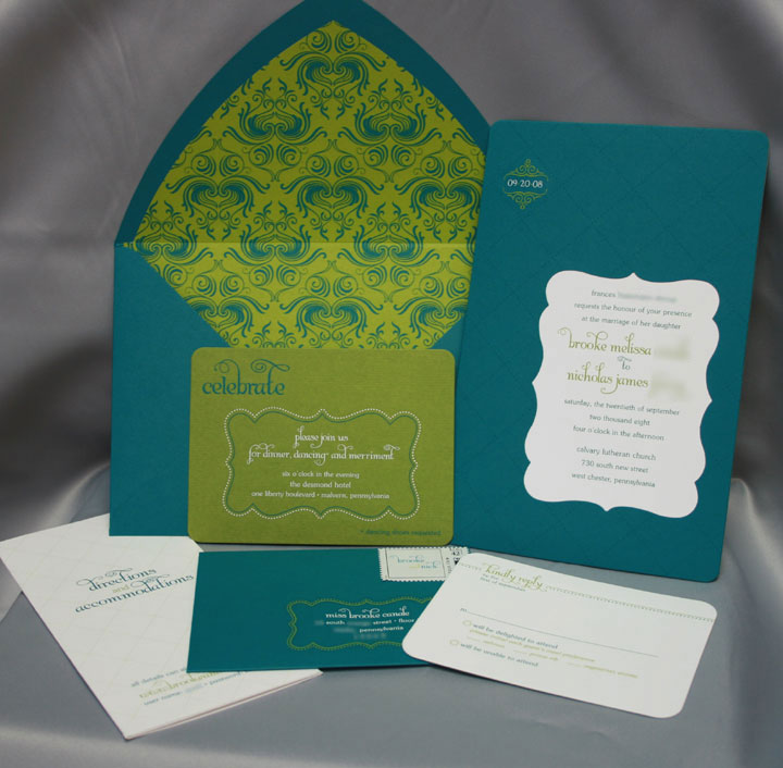

Close-up of the envelope liner and the invitation. The top teal layer of the invitation is die-cut with the scroll shape, and layered on top of the white layer with our actual wedding info.

The top left corner of the invitation with our wedding date engraved
Engraving is a really amazing printing method. Never seen it? Allow me to tell you more…
Basically, engraving is the only process that allows the ink to sit on top of the paper, creating both crisp ink definition and a raised texture. The back side of the paper is “bruised” from the pressure of the engraving process, giving it a delectable hand-touched feeling (which is illustrated in a photo further down in this post). Thermography is also raised printing, but it creates a shiny effect (which, personally, I am not a fan of), and does not create bruising. The raised effect of thermography is a result of a resin powder that is applied to an offset printed piece, rather than the pressure of the engraving process.
Some people mistake engraving for letterpress, simply because they haven’t seen it before and they are only familiar with the texture that results from letterpress. The main difference here is that with letterpress, the ink is actually pressed into the paper, creating a relief texture. This results in a beautiful piece, but does limit your ability to use dark or colored papers. With the aforementioned pressure used in the engraving process, the ink sits on top of the paper, allowing for some amazing and crisp contrast. The green and white ink on the teal paper would not be so crisp and bold if I had used letterpress. (And don’t get me wrong — I love me some letterpress, but this particular design would not have worked with letterpress.)
I have to thank fellow doll and Louella Court contributor, Maggie, for taking pity on my poor, pathetic camera and letting me borrow her fabulous camera to capture these detailed photos for you (thanks, Maggie!). Below is a bit more invitation eye-candy that resulted from my little glamour shoot and hopefully these photos will help you see what engraving allows you to do.

I used Albemarle Swash for our names; the rest of the type is ITC Souvenir

I love how the envelope liner ties it all together! The vector art pattern was purchased on istockphoto.com and I modified the colors and tiled the seamless pattern in Adobe Illustrator. The envelope liner was flat printed (also referred to as “offset”), because engraving would have been a little ridiculous and the amount of coverage would have made it extremely difficult for our engraver.

I am in love with our reception card

My absolute favorite detail…. I put an asterisk after “dancing” and added this line at the bottom. I think it’s charming, if I do say so myself!

This close-up really illustrates the texture of engraving. See how there is actually some dimension to the word “celebrate” sitting on top of the paper?
And here is what the back of the reception card looks like. I had it duplexed with teal stock to add a little surprise element of color to the back of the card, but what I really want to show you is the bruising that occurred from the engraving process. You can see the indentation of the scroll shape as well as where all of the type is. Isn’t that fabulous?

Our reply set


I couldn’t bear the thought of mismatched stamps after all of the work I put into the invites, so I bit the bullet and ordered custom stamps from Zazzle. I requested expedited service since I had put off getting my stamps — I ordered them at 10 a.m. on a Wednesday morning and received them at 10 a.m. the following day, from California! Not bad for $18.99 extra, and totally worth it to get these in the mail a little quicker.

A detailed look at the response envelope

I flat-printed our directions and accommodations insert. I made it a tri-fold to include every ounce of information our guests could possibly need!


If you ever doubted how committed I am to details, I’m sure there’s no denying it now!

The beautiful calligraphy

The back of our outer envelope, complete with our wedding date
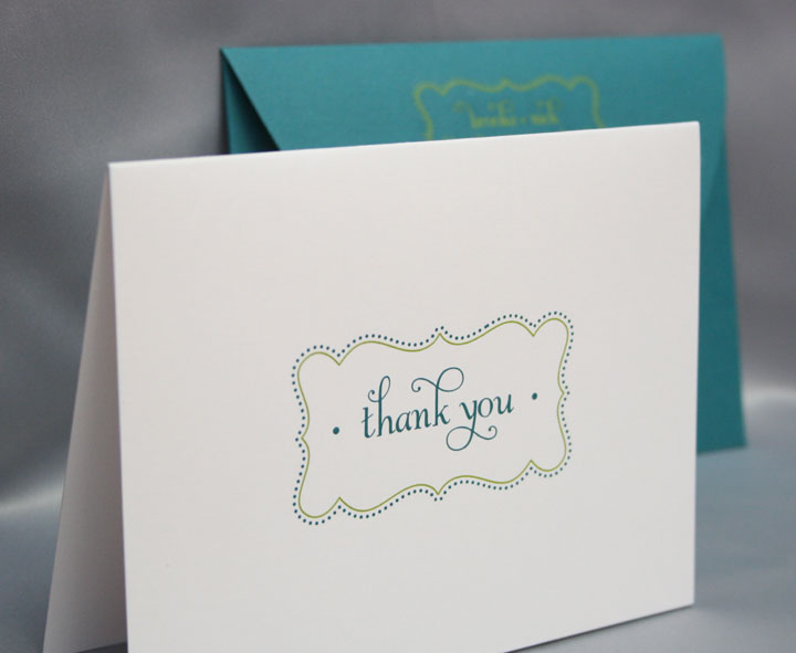
Engraved thank you notes to correspond with our invitations

And matching envelopes, to boot
So, there you have it! I fully realize how completely fortunate I am to work in this place with all of these spectacular resources, and I probably would have had a much more difficult time trying to coordinate all of the engraving details on my own without the help of some generous colleagues. All of the hard work paid off as the invites have been getting rave reviews from our friends and family. And, hopefully this invitation suite will open the doors for some other new and innovative designs here at TPD and LP, as we’re always looking for a challenge!


August 13, 2008 at 3:57 pm |
awesome job! they are beautiful. i’m a designer too so i understand our obsession to details. i wish i was invited to your wedding tee hee.
August 14, 2008 at 4:58 am |
These are so completely stunning I drooled over them from the moment I saw them! I love them!
August 18, 2008 at 3:30 pm |
The embossing & engraving on these invitations are exquisite!! The raised print really adds and to the feeling of this being a *special* day, not just your run-of-the-mill party. Beautiful!
September 7, 2008 at 7:21 pm |
HOT. HOT. HOT.
gorgeous.
stunning.
well done.
& congratulations!
;)e
October 7, 2008 at 7:22 pm |
These are all stunning! I love the dancing shoes detail! Makes it more unique and special.
October 12, 2008 at 11:40 pm |
Hey Brooke- The Wiebners shots of your invites are gorgeous and I had to come and tell you how much I loved the photos! Everything looks gorgeous!
November 20, 2011 at 1:49 am |
May I ask what colour ink (PMS or CMYK) the teal and green are?